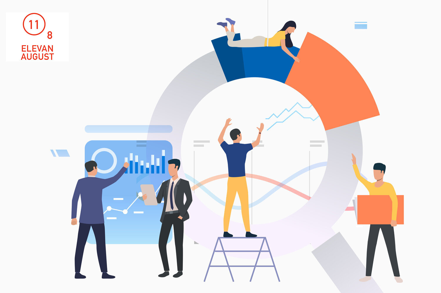

Your page loads. But that’s not enough anymore.
Users judge speed in moments, not seconds. And most of them are doing it from a mobile device (while on the move, in between tasks, or mid-scroll).
If your page feels clunky or slow to load, they leave. Even high-intent traffic drops off when the experience creates friction.
Here’s what we’ve learned matters most when designing for speed and mobile-first UX.
Page speed starts with how the site is built
Fast websites don’t happen at the server level alone. They start at the design stage.
The more animations, layered scripts, or oversized hero images you include, the heavier the page becomes. That weight slows everything, from first paint to interactive clicks.
What works better is simplicity. A clean layout, fewer dependencies, and compressed assets help pages load quickly on any connection. For Singapore users relying on mobile data, this difference is especially noticeable.
Mobile-first means designing for touch, not shrinking desktop
A page that looks okay on mobile can still feel clumsy to use. It may load fine and scale well, but real interaction depends on touch.
Mobile-first UX asks different questions. Can users tap without zooming? Can they reach key buttons with one hand? Do menus open smoothly, or create more effort?
Many designs check the box for responsiveness without thinking through behaviour. On smaller screens, friction multiplies fast.
Designing for touch means planning for simplicity, which focuses on fewer layers, faster access, and movement that feels intuitive.
Layout choices directly influence perceived speed
Even if your site loads fast in metrics, users might still feel it’s slow.
That perception often comes from poor layout logic. If nothing meaningful appears above the fold, or if fonts flash before settling, visitors sense lag, even when it doesn’t exist.
Loading key content first, setting image placeholders, and minimising layout shifts help the page feel smoother. Perception drives behaviour just as much as performance.
Content hierarchy shapes how users scroll
Most users arrive mid-scroll, not ready to explore. On mobile, especially, they pause only when something feels worth their time.
The way your content is structured shapes that decision. When a page opens with clear cues (like what the page covers, where it’s going, and why it matters), people tend to stay longer.
Think of headings as road signs. They guide attention and help readers decide whether to keep moving or stop and engage.
It’s not just for users, either. Search engines read structure too. Strong hierarchy gives your page a better chance at visibility and featured results.
Interactive elements carry the most friction
Anything that moves, expands, or loads externally adds risk. Sliders, pop-ups, chat widgets—all of these can delay page interactions.
That doesn’t mean avoiding interactivity entirely. It means using it with care. Limit to what supports the user’s goal.
In many audits, removing one unused plugin shaved seconds off mobile load time. The lighter the experience, the easier it is to stay focused on the action.
Visual decisions shape how users interact
What looks good on desktop can feel slow or awkward on mobile. This is where design often gets misread.
Fonts that appear sleek on large screens sometimes shrink too far for mobile reading. Colors that work in studio settings may fade under sunlight. Image files optimised for retina displays can take too long to load on mobile networks.
These aren’t minor issues. They affect how easily someone moves through your site and whether they choose to stay.
When visual choices support ease, people scroll further without thinking about it.
Final Thoughts
Designing for mobile speed is less about coding and more about intent. It’s what you choose to prioritise, where you place friction, and how the page behaves when it’s actually in someone’s hand.
At Elevan August, the Best Graphic Design Agency in Singapore, we build with that in mind.
We look at structure, movement, and load time through the eyes of real users (especially the ones you want to keep).
If your site looks great but doesn’t feel easy to use, that gap may be costing more than you think. Let’s fix it before it slows things down further. Get in touch with us today.